Discussion of HeatCheck
Throughout my time playing for UCLA men’s water polo, I, along with the rest of the goalkeepers, studied the shooting tendencies of our opponents to be prepared for our games. As vital as this process is for high-level goalkeeping, there was no systematic method for doing it.
During my years competing, the best method was essentially to watch film and to read scouting packets. While these are both incredibly important methods, it was hard to grasp a complete picture. Often it would even be hard to grasp a clear picture because of how much information was trying to be conveyed in writing. Nearing the end of a season, a skilled shooter’s scouting packet would essentially contain a description of every shot possible in the game of water polo. When looking for tendencies, this made the descriptions nearly useless. Identifying this problem led me to the idea for HeatCheck.
I developed HeatCheck as a system and offered to help the UCLA women’s water polo team throughout their 2024 season by creating visualizations for their opponents each week.
Idea and Challenges
With the idea of improving the learning process, I settled on creating a heat map of shooting tendencies for each opponent. Before diving into data collection or complicated visualization, I needed to figure out a system for representing shots. Of course, water polo is much more complex than what can be usefully shown on a screen, so I had to decide what information was most important to convey and what could be grouped together.
The most obvious needs were a way to represent a specific player and their targets on goal. Player representation was easy, I simply used cap numbers since in the NCAA these are generally not allowed to change throughout the season. Target on goal was slightly more complicated. I did not have the data to show the precise location of each shot, so I needed to group shots by area. Using my knowledge as a goalkeeper, I grouped the goal into 8 zones. These were the top corners, the low corners (which included skip shots to that side), above the goalie’s head, below the goalie’s arms, and lobs to each side of the goal. I then assigned a number from 1 to 8 to each zone as a way to represent targets as data.
From there, I grouped specific shots into what position they were shot from and during what phase of the game (front court offense, counterattack, 6 on 5 offense, or penalties for those familiar). Sports, especially water polo, do not categorize themselves perfectly into boxes like the ones mentioned above. Because of that, it was important to maintain consistency in categorizing certain “borderline” cases.
The last bit of data I collected was whether the shot came from faking or no faking. This variable proved to be too important to ignore. The difference in target between shots taken with or without fakes showed to be very significant, so it needed to be included.
In developmental versions of HeatCheck, I also collected data on what type of release the player used when shooting (for example a switch wrist, lean, wrap, or backhand among others). However, trying to include this information in the visualization proved to be too overwhelming and better left to watching video. This also brings up another important point that HeatCheck was not intended to replace video or scouting packets. Instead, it was a supplement that could provide another perspective for learning about opponents.
Data Collection
Data collection was the most time-consuming part of the process. It cannot be effectively automated because of the lack of clear boundaries between cases. Creating a useful heat map of shots organized by position requires making judgement calls for many instances as well as calls on the usefulness of a video clip to begin with.
The actual process involved watching a team’s shots from their games throughout the season on Dartfish (where these shots had already been tagged in the game footage). While watching, I would track the key information for each shot: the shooter’s cap number, the number of the target on goal, their position, and the game phase.
Data Representation/Visualization
With an Excel sheet representing a team’s shots up to that point in the season, I connected the data with Power BI. I needed to find balance between providing detailed information and simply having too much on one screen. My initial creation was likely too heavy with information, but I used feedback from the goalkeepers on the UCLA women’s team to create an updated system that conveyed enough information in a format they could still visually understand.

Creating the data visualization meant first creating a goal diagram separated into the eight target sections and linking those sections to their respective target number in the data. The blank canvas goal that was used is shown on the right. The zones are quite self-explanatory except for the two circles above the top corners. These circles represented lobs thrown to the respective side of the goal.
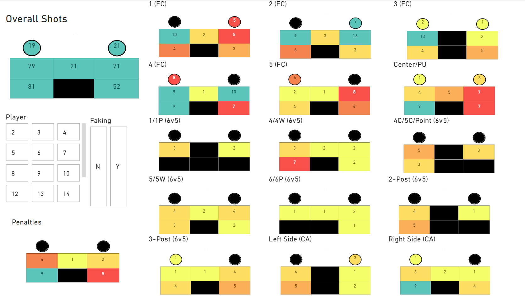
After creating the goal canvas, I started creating the layout for each shooter’s page. A screenshot of the page is shown on the left. Each goal has a label just above it which represents the situation and position from which a shot is taken. The position is written first and then the game situation follows in parenthesis. (They are abbreviated for clarity with abbreviations that the UCLA goalkeepers would understand.) For example, the largest goal in the top left is the overall shots while the goal in the bottom left is the penalty examples.
The array of goals covered the position, game phase, and target of shots. However, I still needed a way show what player was shooting and if they were faking before the shot. These two factors were more suited to filters that would affect the other goals; Trying to double the number of goals in the array to show faking vs not faking would be simply too overwhelming. In the screenshot above, you can see the filters in between the overall shots and the penalty shots displays. (A link to a full, working version of a dashboard is included at the bottom of the blog page).
Usage and Results
Once I completed a final version of the dashboard, I created one for each opponent played. These dashboards were sent out to the coaches to be shared with the team through a secure link.
While I by no means take credit for the women’s team success, HeatCheck at the very least did not hurt their performance as they went undefeated on the entire season and won the Division I national championship. Additionally, their goalkeepers proved time and again to be the best in the country.
- Follow the link below for a live version of one of the dashboards as would have been available to team members during the 2024 season. (The opponent’s name has been removed for privacy and the protection of competitive data since players from the 2024 season are still active.)